

Bringing AML risk checks into the wallet overview
TR.ENERGY users had to open a separate AML tab to check address risk. I brought the latest result onto asset cards, distinguishing unchecked, current, and outdated reports. After release, stakeholders reported increased use of paid checks. Feedback also revealed different needs: frequent users welcomed the summary, while some less frequent users found it added clutter. I designed a global visibility setting in response.
- Product
- TR.ENERGY Wallet · mobile app
- My role
- Sole Product Designer · interaction design through implementation support
- Team
- PM, stakeholders, frontend engineers
- Design
- Approximately 3 weeks, alongside other tasks
- Project duration
- Approximately 2 months, including delivery and the feedback-driven update
- Status
- Shipped
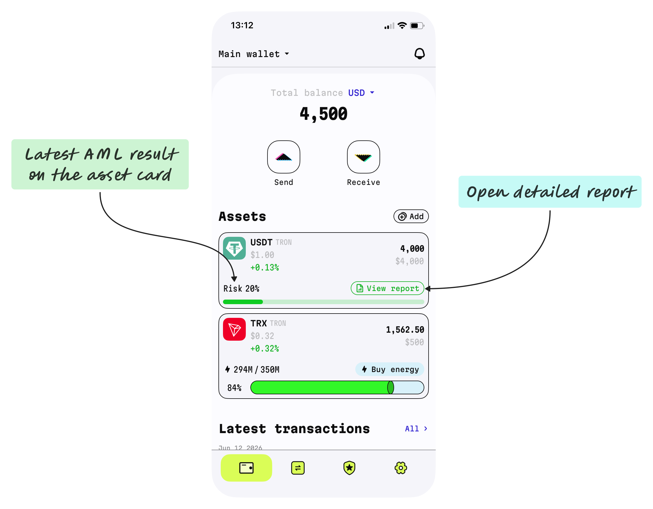
Bringing the latest result closer to the task
TR.ENERGY served a mix of users, including crypto professionals making frequent transactions and managing substantial funds. The app already offered anti-money-laundering (AML) address checks and detailed reports through a dedicated tab. Users selected an address there to run a check or inspect an earlier report.
Key users and stakeholders asked to see AML status on the wallet’s main screen. I explored how to bring the latest result onto each asset card while keeping the card compact. Each card represented one address and displayed its own risk score.
The aim was to make the result easier to find and the next action easier to understand. Because checks were paid, encouraging use of the existing checking service was also a business consideration.
Separating risk from report freshness
A score alone could not explain whether an address had never been checked or whether its previous result needed updating. I combined a percentage and risk bar with an action that changed according to the report state.
| Report state | Asset-card display | Action |
|---|---|---|
| Not checked | No score and an empty bar | Check starts the checking workflow. |
| Current report | Risk percentage and a colored bar | View report opens the latest detailed report. |
| Outdated result | Previous percentage remains visible, with the score and bar shown in gray | Check again starts a new check. |
For current reports, green, yellow, and red bars represented low, medium, and high risk. When a result became outdated, the interface retained the previous score but removed its risk color and changed the action to “Check again.”
Reports became outdated after a time interval or new transactions. Stakeholders defined the time-based rule; I proposed treating new transactions as a reason to refresh the result. The score itself was not continuously recalculated: obtaining an updated result required another check.
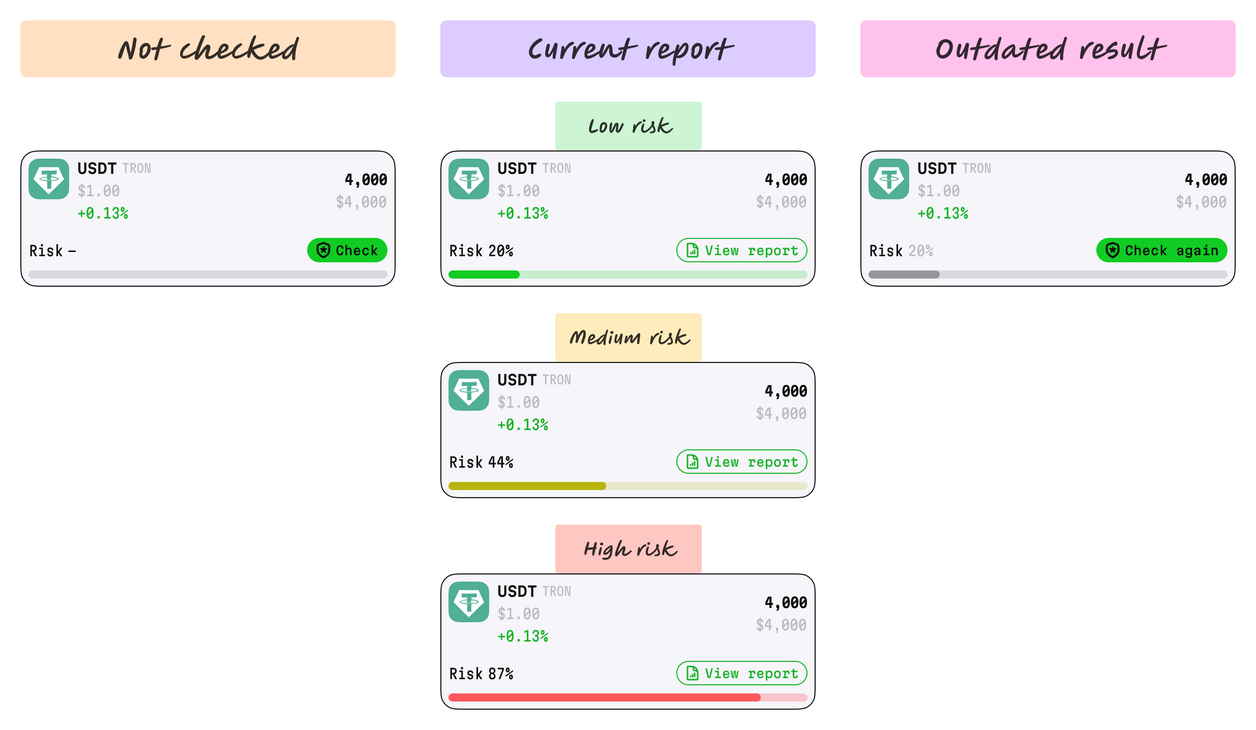
The limited space shaped the design. I explored several layouts and selected one with stakeholders that kept the summary within the asset card. Changing the action label gave each report state a corresponding next step without adding a separate set of controls.
Connecting the summary to checks and reports
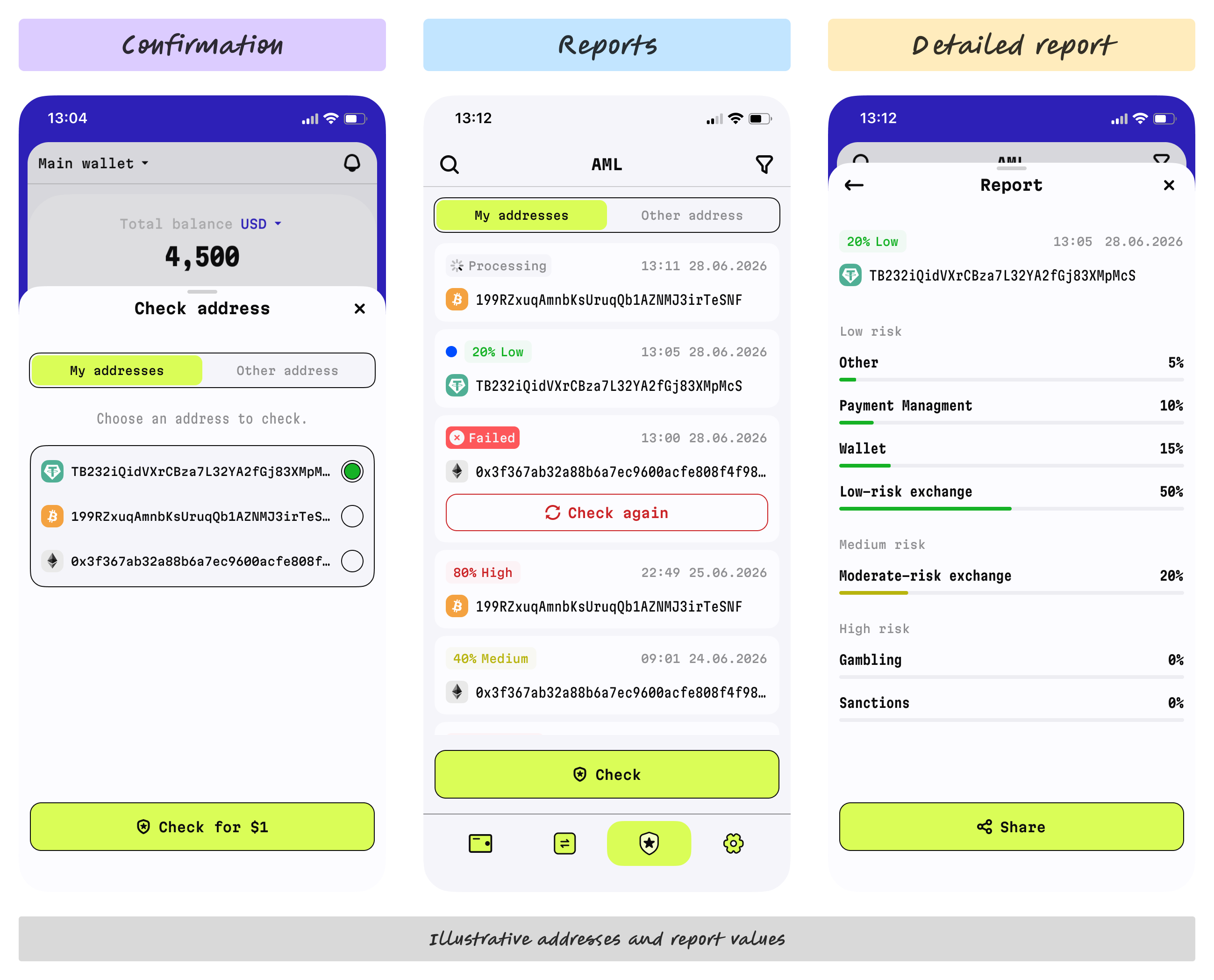
I adapted the checking flow I had designed earlier. Starting from an asset card opened a sheet listing the available addresses, with that card’s address already selected. The “Check for $1” button displayed the cost before users committed to the check.
After confirmation, the sheet closed and users moved to the reports page in the AML tab, where a new entry showed that the check was processing. When it completed, the entry displayed the resulting risk percentage and level. Tapping it opened the detailed report. Users who had left that screen received an in-app or push notification, depending on whether they were still using the app.
The detailed report provided explanations and risk breakdowns beyond the compact card summary. Earlier reports remained available in the AML tab, including reports whose scores were marked as outdated on the asset card.
Making the summary optional after launch
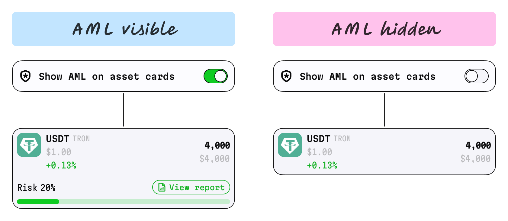
The first release showed the AML summary on asset cards by default. Users who had requested it responded positively, but another group reported that the additional information made the interface feel heavier. These users made fewer transactions or did not need AML information in their everyday wallet view.
I initially heard this feedback through the PM and support team, then read the user messages shared in our project chat. I proposed a global setting to control whether AML information appeared on asset cards.
The update kept AML visible by default and allowed users to hide the section across all cards through Settings. This gave users a way to adjust the wallet overview to their needs while keeping reports accessible through the dedicated AML tab.
Implementation and feedback
I worked with frontend engineers through implementation, refining risk-bar animation, transitions, localized button labels, and component states. I also designed error states for connection issues and insufficient funds.
After the initial release, stakeholders reported more Check-button taps and completed paid checks. I do not have analytics to quantify the increase or isolate the design’s contribution. After the visibility update, I personally read positive feedback shared by support: users welcomed the option to hide AML information. Comprehension and task completion were not measured.
The project highlighted a trade-off: information valuable to frequent users can add clutter for others. Making the summary optional let users adapt the wallet overview to their needs.