

Designing a flexible workspace for sequence analysis
I designed Platforma’s multiple sequence alignment (MSA) workspace from scratch. The challenge was to fit sequence detail and supporting visualizations into limited screen space while accommodating different scientific tasks. I created configurable layouts, then used feedback to design compact alignment and heatmap views. The workspace was implemented and released.
- Product
- Platforma, MiLaboratories
- My role
- Workspace and interaction design, components, documentation, and engineering collaboration
- Scope
- New sequence-analysis workspace
- Design
- Approximately four weeks of dedicated work
- Delivery
- Workspace released to users
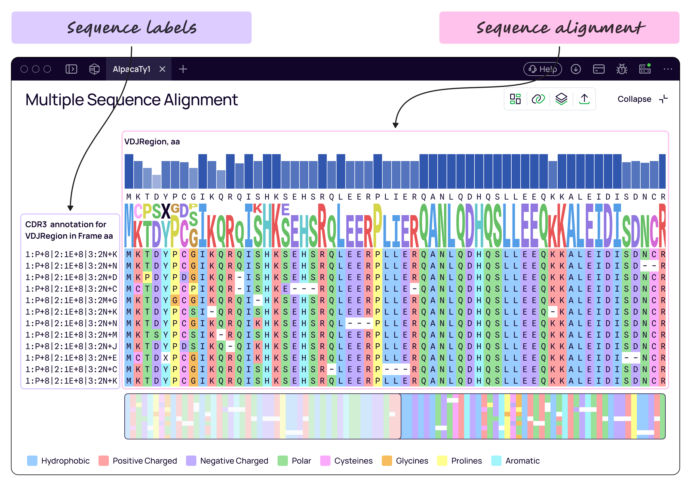
Bringing visual sequence comparison into Platforma
Platforma already offered table views for analyzing sequences, but users needed a dedicated workspace for more detailed visual comparison. They could also use MSA tools in other software. The CEO initiated the project to bring this capability into Platforma.
MSA arranges biological sequences so researchers can compare corresponding positions. For example, a scientist reviewing antibody candidates can inspect where their sequences differ and use a tree to explore relationships between them. This helps them examine diversity within the candidate set.
These tasks required different visual priorities: reading individual sequence characters, seeing broader patterns, or examining related information alongside the alignment.
Keeping scientific conventions familiar
The CEO demonstrated real workflows and explained the required functionality. I also reviewed five or six competing MSA tools to understand established ways of presenting alignments, heatmaps, trees, consensus views, and sequence logos.
Scientists defined which information needed to be compared; I decided how to arrange and navigate it. I kept familiar scientific representations and focused my design work on layout, visibility, and information density. I reused Platforma’s design-system components and created new components where needed.
Choosing the views relevant to the task
Showing every analytical view at once would leave less space for the information relevant to the current task. I designed controls that let researchers show or hide individual views—including trees, metadata columns, heatmaps, consensus views, and sequence logos—as their focus changed.
This let researchers adjust the workspace around the information they needed to compare. Label columns could also be pinned to keep reference information visible during navigation.
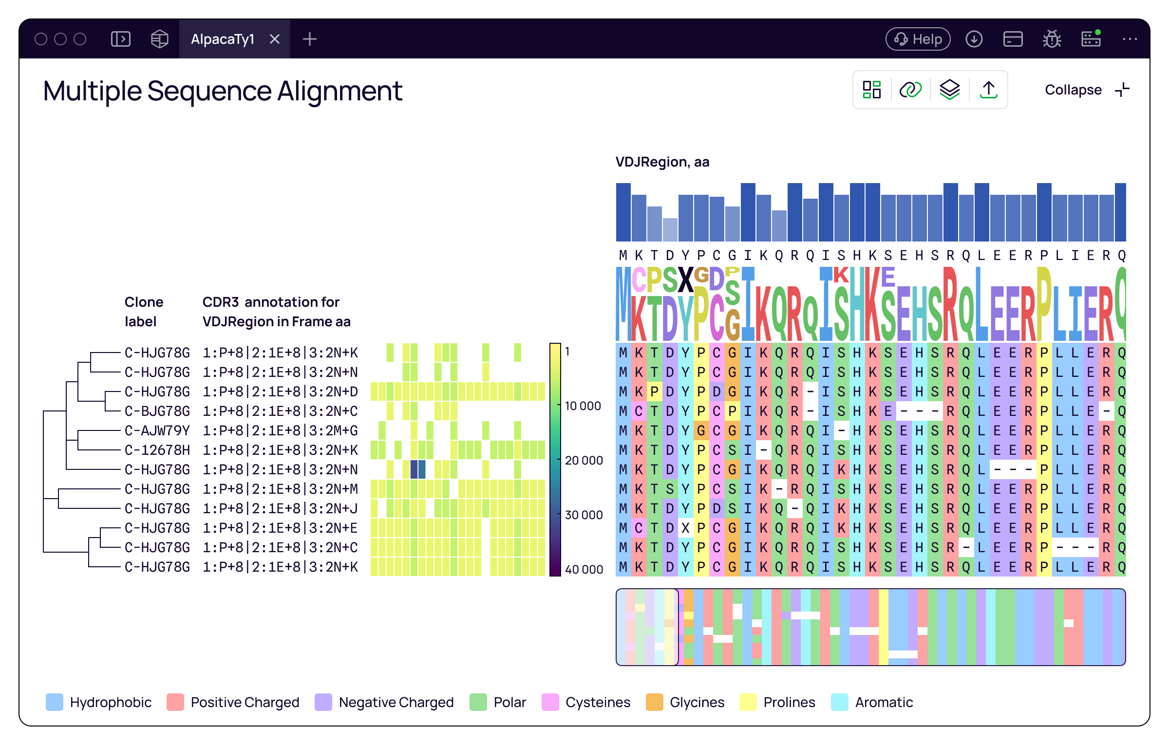
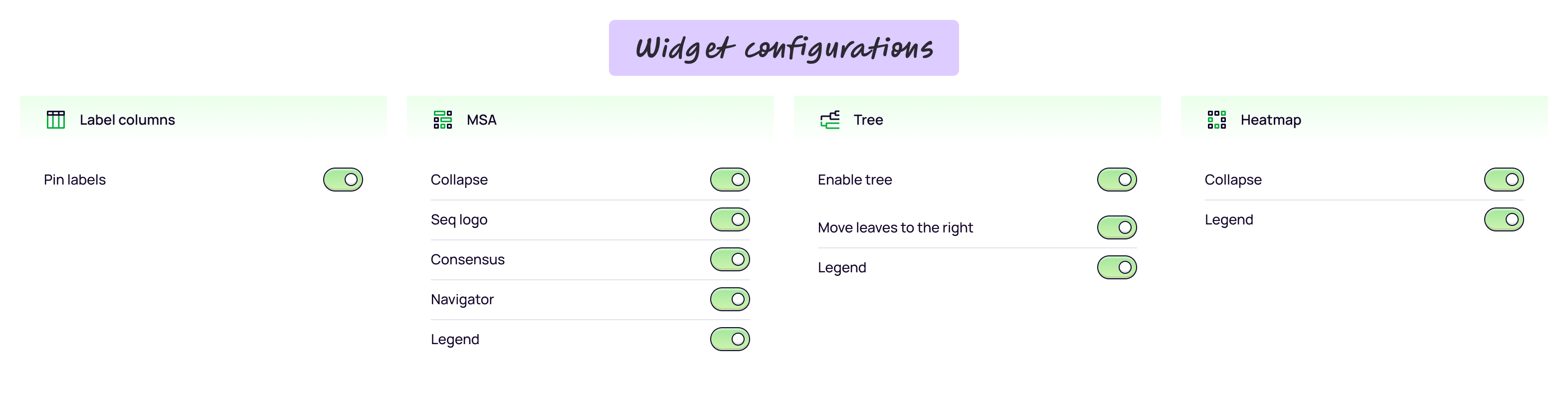
- Choose which analytical views to display for the current task.
Changing information density after user feedback
User feedback revealed a limitation: with large datasets, the heatmap and alignment became too wide to view comfortably together. Showing or hiding a view did not address the need to compare both at once.
I designed expanded and collapsed states for each view. Expanded MSA displayed individual sequence characters and could show the consensus and sequence logo. Collapsing MSA hid the characters and those three supporting views, retaining a compact color-pattern overview. The heatmap similarly offered detailed and compressed states.
This gave researchers a way to devote more space to one view while keeping an overview of the other. The tradeoff was between readable detail and visible coverage: compact views supported scanning patterns, while expanded views supported closer inspection.
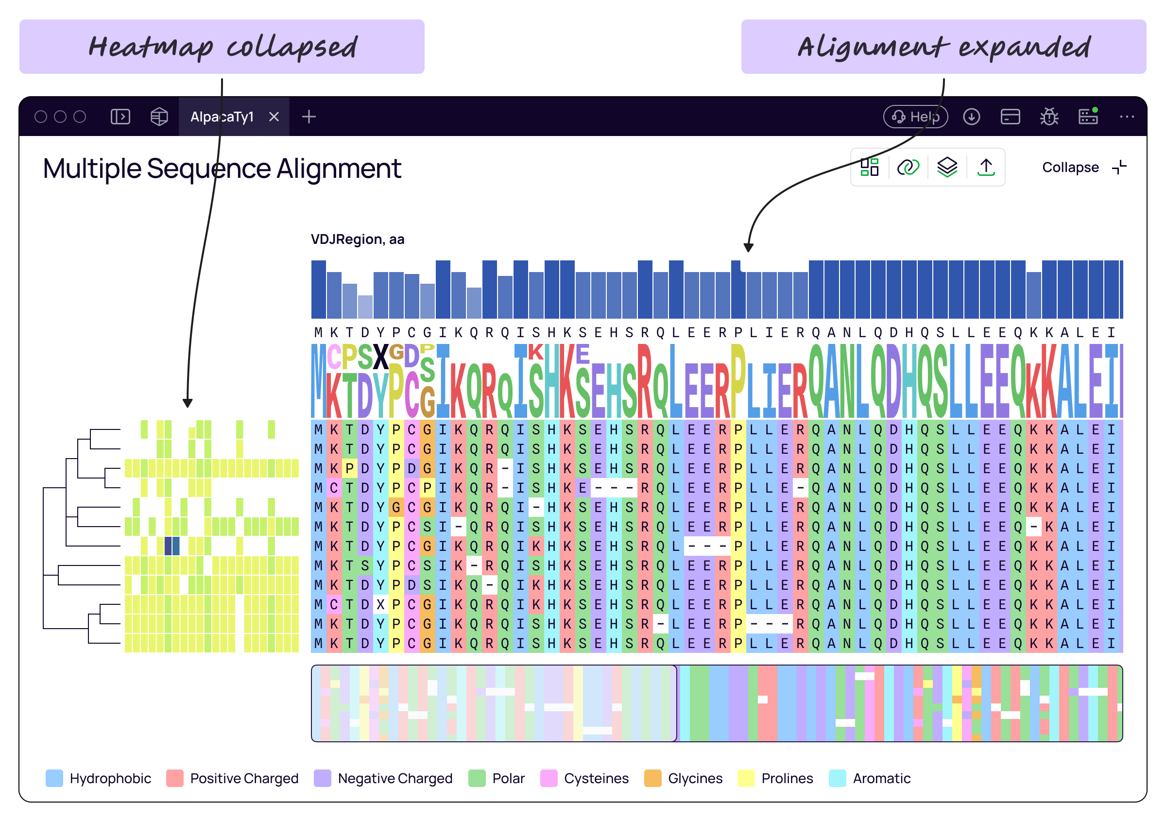
- Individual sequence characters and supporting views are visible; the compact heatmap leaves more room for sequence inspection.
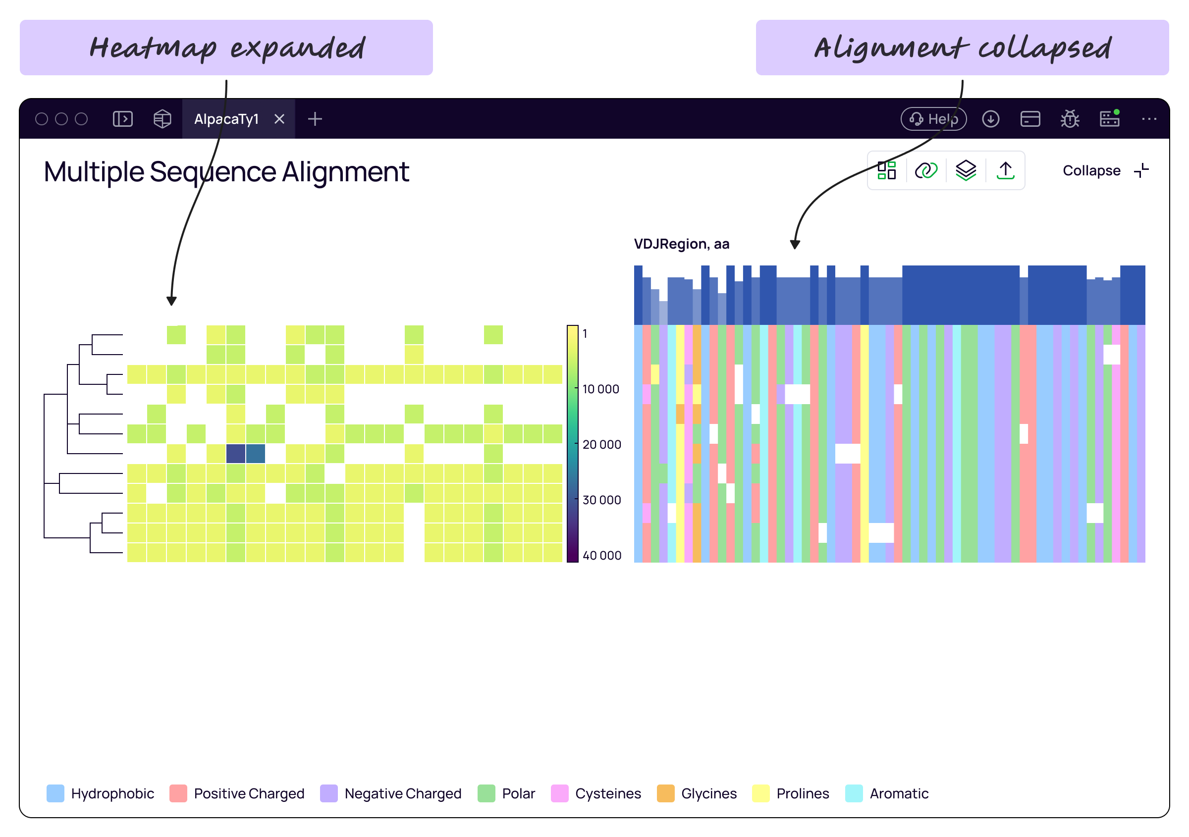
- Sequence characters, consensus, and sequence logo are hidden, leaving a compact pattern overview beside the expanded heatmap.
Reviewing tasks and supporting implementation
I reviewed the design by working through documented biological tasks with step-by-step instructions. This let me check the workspace against the activities it needed to support.
After the CEO approved the design, I wrote documentation and walked engineering through the behavior. We reviewed the design together, and I stayed closely involved during implementation to clarify interactions and answer questions.
What shipped
The team implemented and released the MSA workspace, adding dedicated visual sequence comparison alongside Platforma’s table views. I owned the interface design from the initial layout through component creation, documentation, and engineering collaboration.
The project brought the screen-space problem into focus: researchers needed control over both which views were visible and how much detail each view displayed. The resulting design addressed those needs through visibility controls and compact views.