

Redesigning Platforma’s website for different audiences
Platforma had expanded into biological research workflows, developer tools, and enterprise deployment options, but its website still offered brief explanations of a much smaller product. The CEO initiated a redesign to support product evaluation and encourage demo and pilot conversations ahead of a marketing campaign.
As the sole designer, I restructured the information, designed the pages and graphics, and built the website in Framer, taking the complete redesign through launch in approximately one month.
- Product
- Platforma — biological data analysis software by MiLaboratories
- My role
- Sole designer; information architecture, page design, graphics, and Framer implementation
- Collaboration
- CEO, GTM lead, support team, and a front-end engineer for forms requiring backend connections
- Timeline
- Approximately one month for the redesign and build, timed to a marketing campaign
- Status
- Complete redesign shipped; followed by launch fixes and homepage experimentation
- Website
- platforma.bio
Giving each workflow room to explain its value
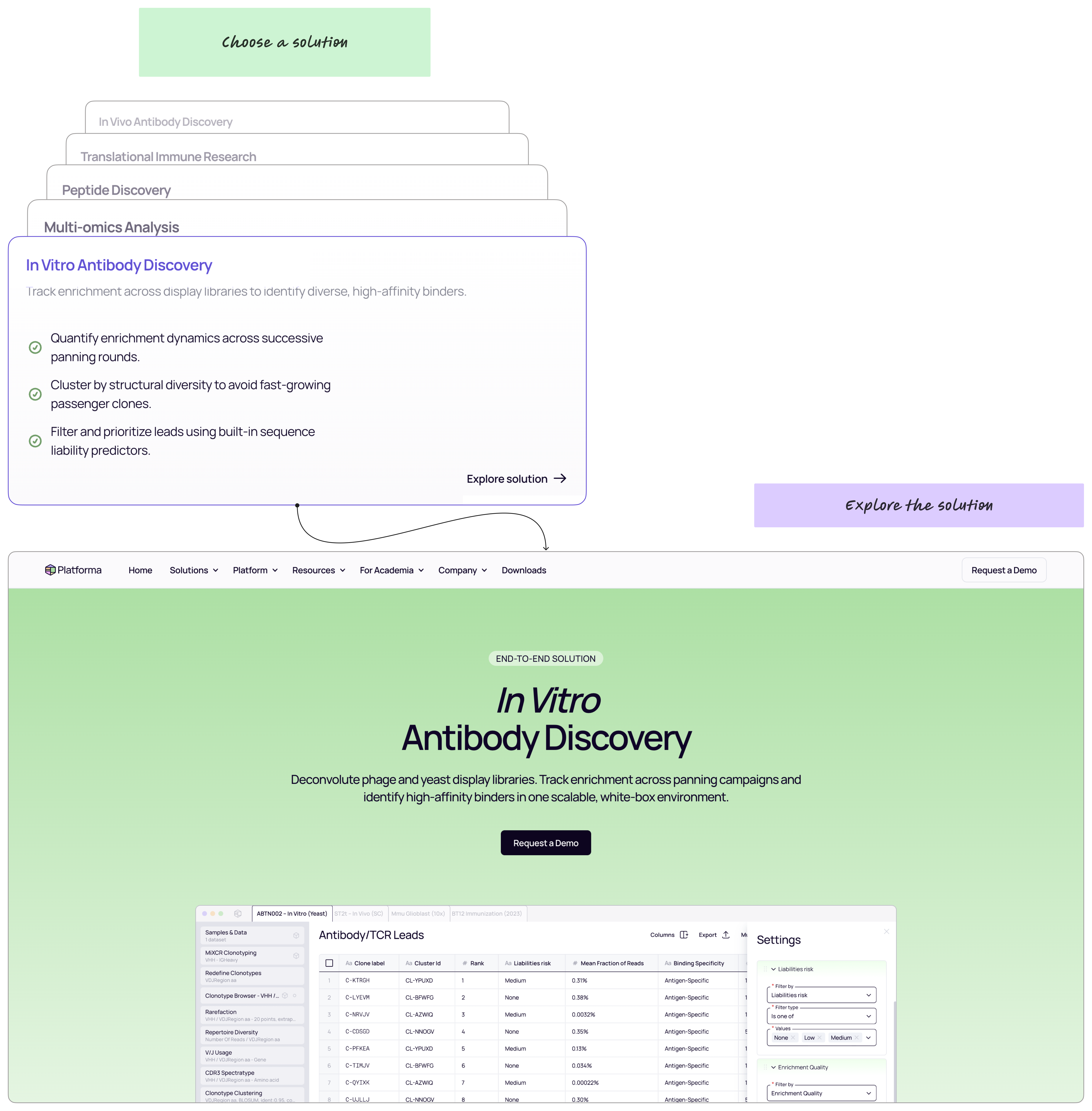
Previously, solutions shared one page, with only two or three paragraphs describing each. That left little room to explain how Platforma supported tasks such as antibody discovery, immune research, and multi-omics analysis.
I created a Solutions hub with a dedicated page for each workflow, combining detailed explanations with workflow examples. Discussions with the CEO, who regularly spoke with customers, alongside support and the GTM lead, informed the audience needs behind the structure.
I also created an Application Notes page to bring together case studies, application notes, and technical notes. This gave visitors a dedicated place to explore practical examples and more detailed material.
Separating scientific value from technical evaluation
Scientists needed to understand the research workflows, while enterprise evaluators needed information about infrastructure, security, and deployment. Developers needed to understand how they could extend the product. Academic researchers also had a separate route to request access.
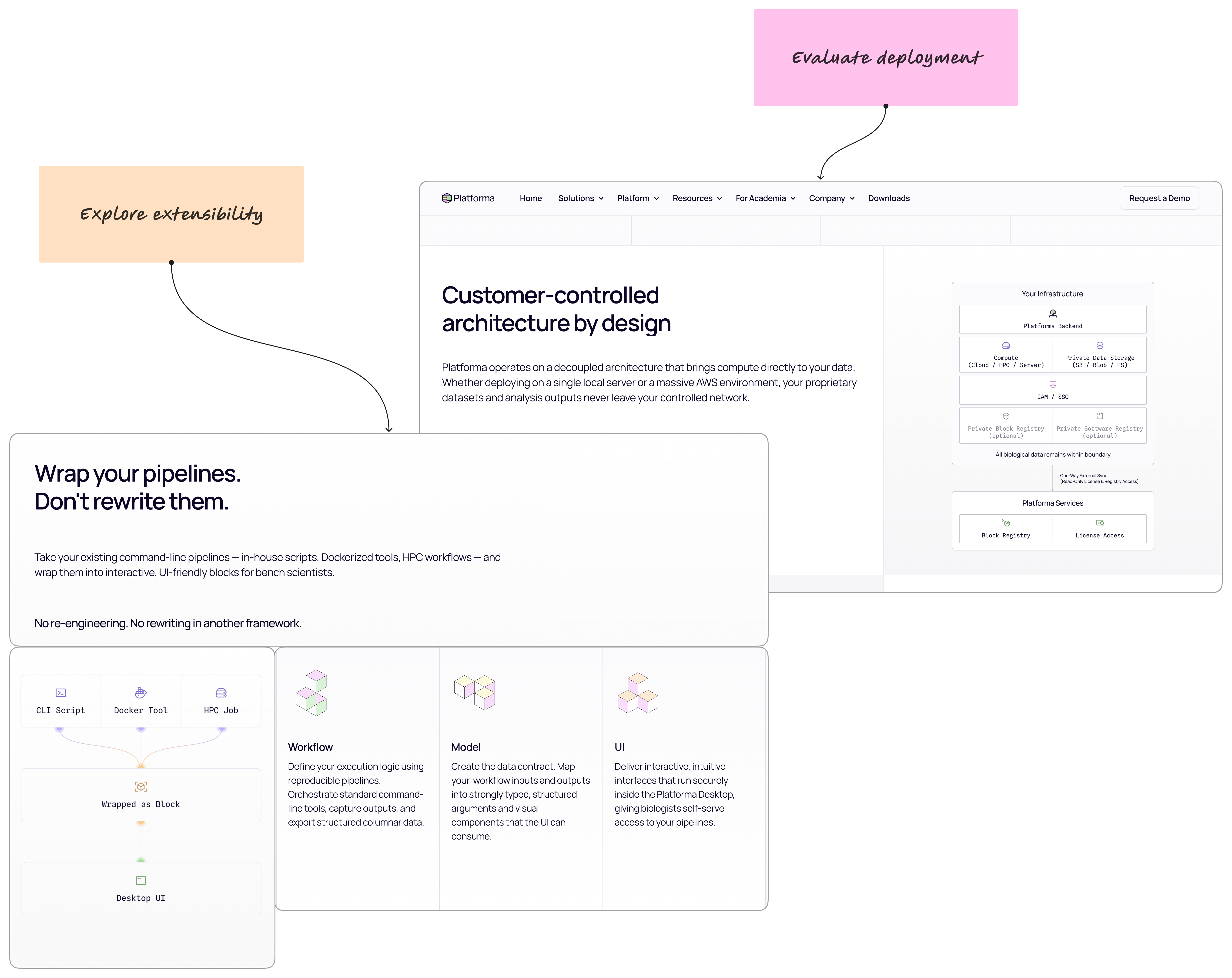
Under Platform, I organized the technical information into three pages: Overview, Deployment, and SDK. Each addressed a different question: how the platform fits together, how an organization can run it, and how technical teams can build on it.
I designed the page structures and all diagrams and illustrations to work alongside the explanations. The CEO defined the positioning, supplied the initial copy, and checked technical accuracy; we refined the text together during implementation.
Building, launching, and refining
I implemented the website in Framer, using ChatGPT to challenge my reasoning and help with development. A front-end engineer supported the forms that required backend connections. After launch, teammates reported issues such as broken links and images failing to load, which I corrected promptly.
We then compared four homepage hero variants for an antibody-discovery audience, using different combinations of headlines, supporting copy, calls to action, and imagery. The team tracked engagement and onward navigation and retained the version judged to perform best.
The CEO also relayed positive feedback from customer meetings, specifically about the website’s information structure. This provided qualitative support for the redesign; I do not have figures establishing its effect on demo or pilot requests.
The delivered website brought workflow explanations, technical evaluation, and supporting resources into a shared structure, with routes for visitors to explore the product, request a demo, or apply for academic access.