Building a scalable design system from scratch
Context
When I started designing this portfolio, it was still relatively small.
That made it tempting to design individual pages first and formalize the system later.
Instead, I treated the website as a product from the beginning and established shared foundations before the number of pages, articles, and interaction patterns started growing.
The goal was not to create a large design system for its own sake. It was to build the smallest system the product actually needed, while making sure it could expand without becoming inconsistent or requiring structural rework.
Challenge
A portfolio seems simple at first: a few pages, navigation, text, images, and calls to action.
But the product quickly grew to include:
- multiple page and content types;
- long-form case studies;
- nested article navigation;
- responsive layouts;
- reusable media and interaction patterns;
- and, later, multiple articles within the same capability.
Without a shared system, every new page could introduce slightly different spacing, typography, responsive behavior, or component logic.
The challenge was to create enough structure to keep the product coherent while avoiding a system that was more complicated than the website itself.
Design principles
Start with foundations, not pages
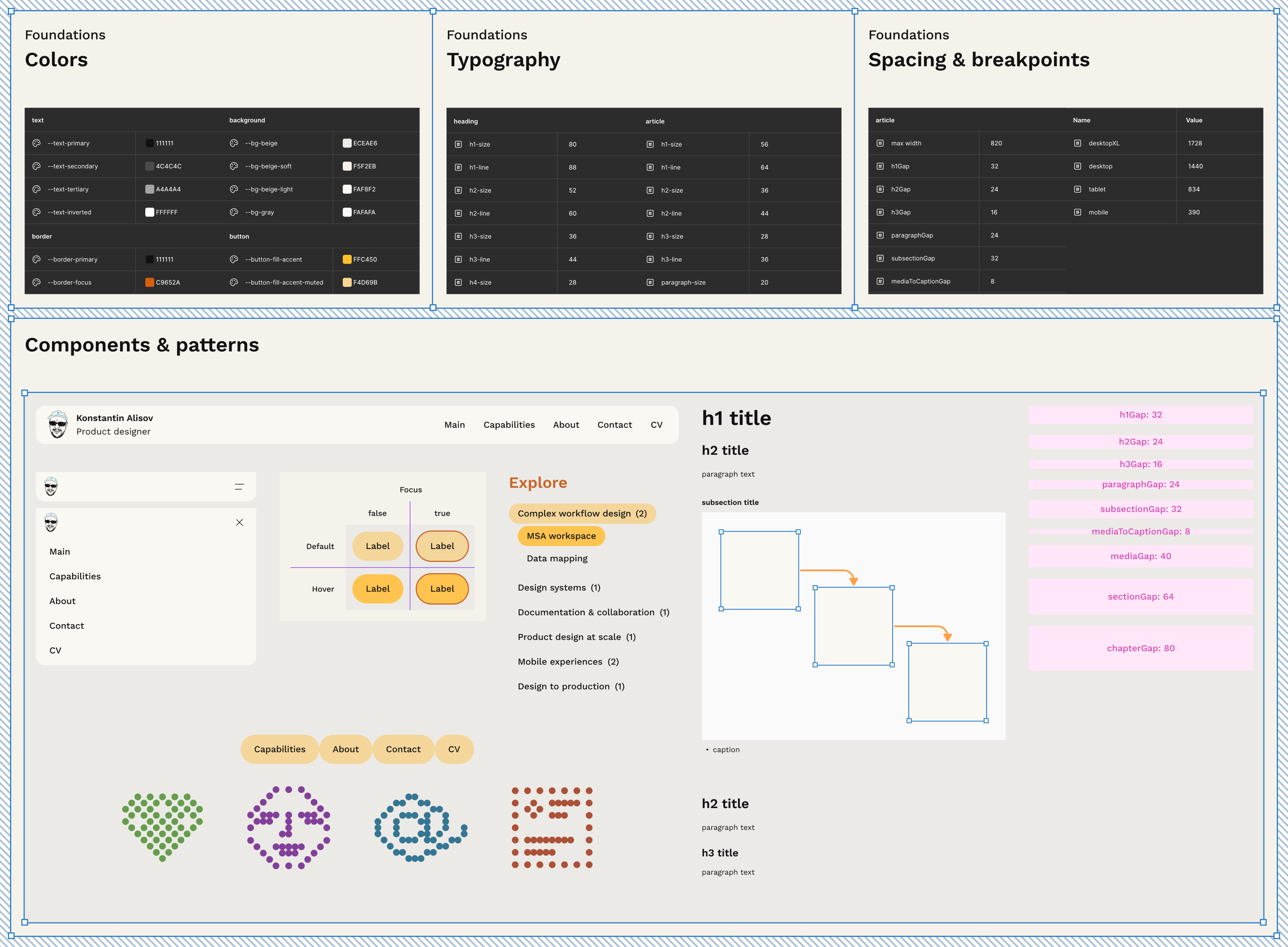
Before treating individual screens as finished designs, I defined the foundations that would be reused throughout the product.
These included:
- typography hierarchy;
- color roles;
- spacing;
- layout behavior;
- responsive rules;
- and reusable visual patterns.
This meant that individual pages were built from shared decisions rather than recreating those decisions locally.
As the portfolio expanded, the same foundations could support new content without changing the visual language.
Turn repeated decisions into reusable components
Not every repeated object needed to become a component immediately.
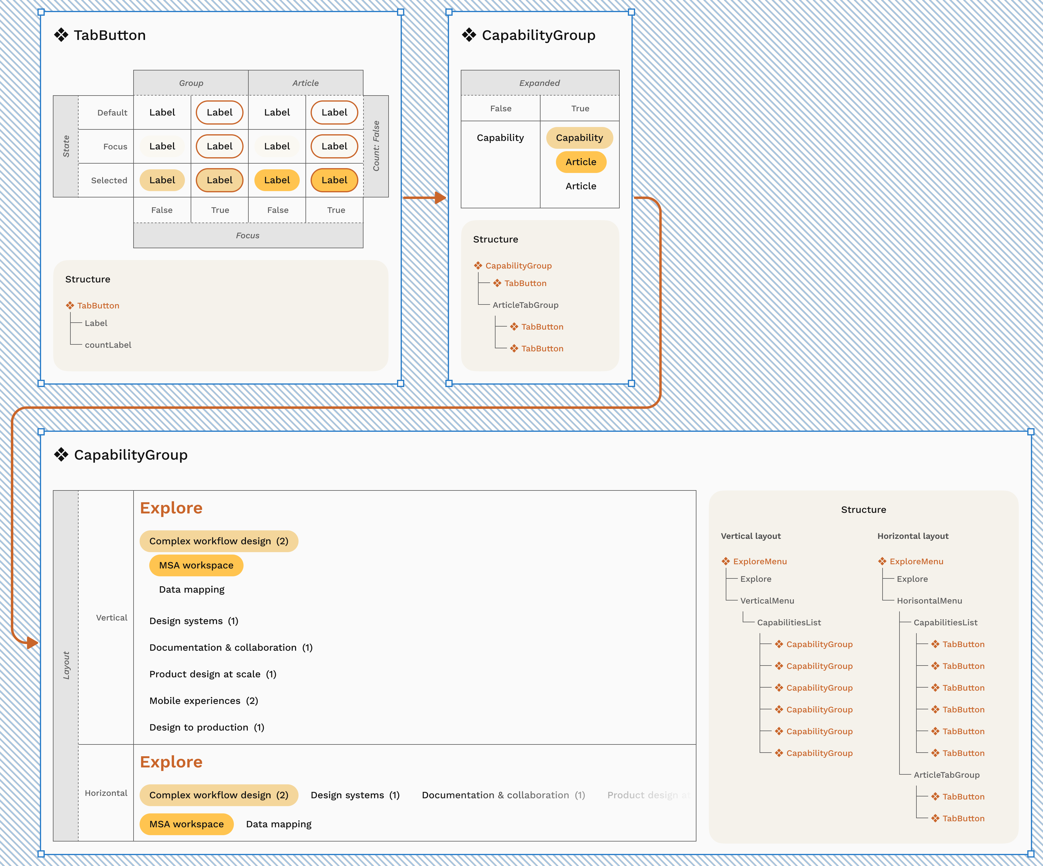
I created reusable components when a pattern had:
- a clear recurring purpose;
- multiple instances;
- meaningful states or variants;
- or behavior that needed to stay consistent across the product.
This included patterns such as navigation, buttons, capability tabs, article structures, media containers, and shared content elements.
The goal was not maximum componentization. It was to remove unnecessary one-off decisions.
Keep the system lean
A scalable design system does not need to predict every future requirement.
I deliberately avoided creating:
- variants with no current use;
- components for unique content;
- abstract structures only because they might become useful later;
- or additional layers of hierarchy that did not solve an existing problem.
New patterns were added when the product demonstrated a real need for them.
This kept the system understandable while leaving clear places for future extension.
Scalable does not mean large. It means the system can grow without becoming inconsistent or requiring structural rework.
Design responsive behavior as part of the component
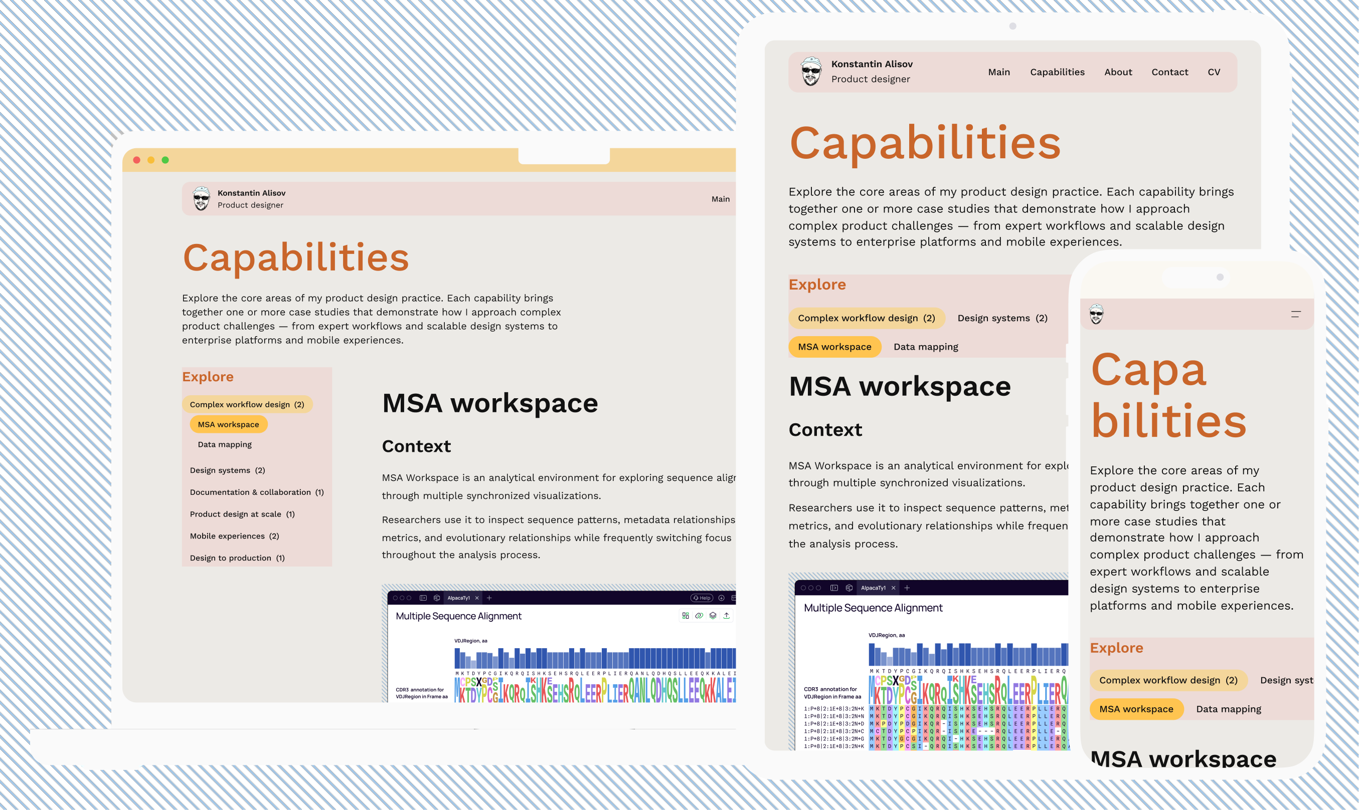
Responsive design was not treated as a separate mobile version of the website.
Components and layouts were designed with rules for how they should behave as available space changed.
Depending on the pattern, this could mean:
- changing layout direction;
- reducing or rebalancing spacing;
- adapting typography;
- restructuring navigation;
- or changing how content and media are arranged.
This allowed the same underlying system to support different screen sizes rather than maintaining parallel desktop and mobile designs.
Connect Figma and production
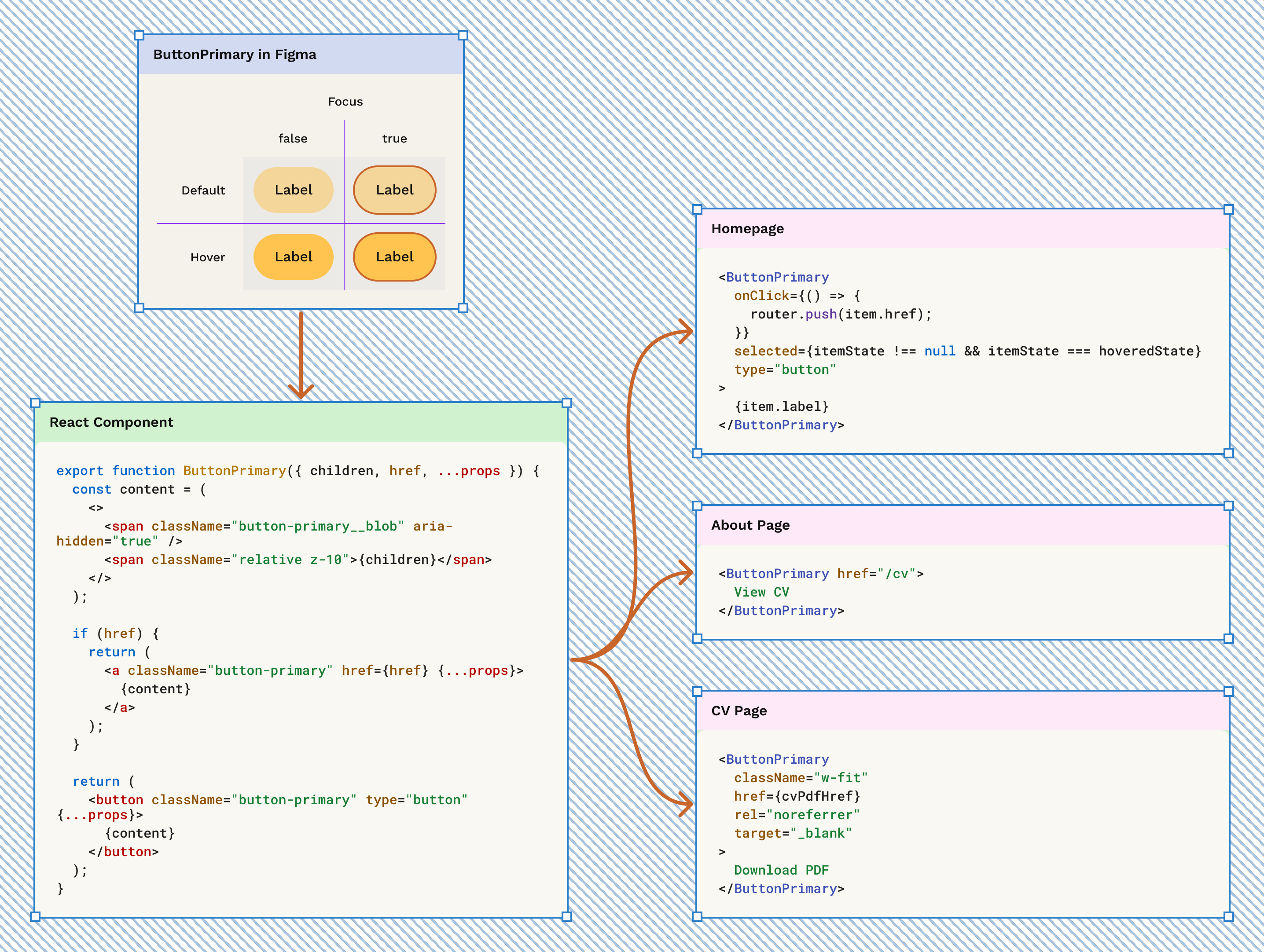
A design system only becomes useful when its logic survives implementation.
Because I also built the portfolio through an AI-assisted development workflow, I could carry the same concepts from Figma into the production codebase.
The system was reflected in:
- reusable interface components;
- shared styles and tokens;
- consistent responsive behavior;
- and common patterns used across pages and articles.
I used ChatGPT and Codex as part of the implementation workflow while remaining responsible for the system structure, design decisions, and final design-to-code consistency.
The goal was not literal one-to-one duplication between Figma and code. It was to maintain the same underlying rules across both.
Design for extension
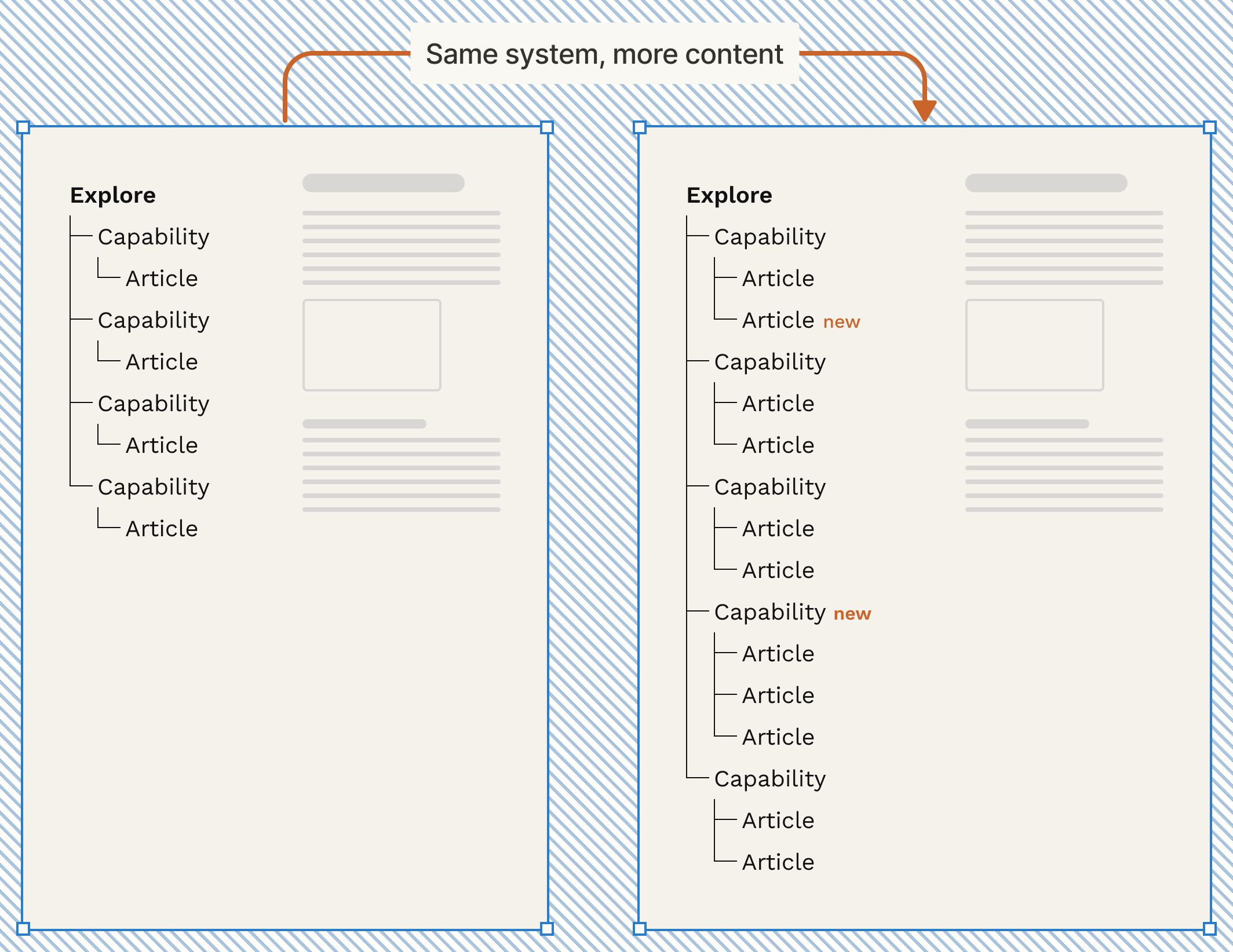
The strongest test of the system came after the original website was already built.
The portfolio continued to grow:
- capability content expanded;
- individual articles received their own routes;
- capabilities gained multiple articles;
- article-level metadata was introduced;
- the Explore navigation evolved to support nested content;
- new case studies were added.
These additions required new content and some new patterns, but they did not require rebuilding the product foundations.
That was the practical test of scalability: the system could absorb new requirements without losing consistency or forcing a redesign of everything that already existed.
What I chose not to systematize
A useful design system also needs boundaries.
Some elements were intentionally left local when:
- they appeared only once;
- their behavior was tightly coupled to specific content;
- abstraction would make them harder to work with;
- or there was no evidence that they would be reused.
This helped avoid turning the design system into an inventory of every object on the website.
Instead, the system focused on decisions that benefited from consistency.
My role
I designed the portfolio and its design system from scratch.
My ownership included:
- defining visual and layout foundations;
- establishing Figma variables and reusable patterns;
- designing component architecture and variants;
- defining responsive behavior;
- evolving the system as new content requirements appeared;
- carrying design-system logic into implementation;
- reviewing design-to-code consistency;
- and maintaining the system as the live product expanded.
Outcome
The resulting system is intentionally small, but complete for the needs of the product today.
It provides:
- consistent foundations across the website;
- reusable components instead of repeated one-off decisions;
- shared responsive behavior;
- a common structure across capability and article pages;
- clear correspondence between design and implementation;
- and room for new content and patterns without rebuilding the system.
Most importantly, the portfolio has already grown beyond its initial scope while continuing to use the same underlying foundations.
The system demonstrates its value not through the number of components it contains, but through its ability to keep the product coherent as it evolves.